Customizing a pivot table
- By Bill Jelen
- 1/10/2022
Changing the calculation in a value field
The Value Field Settings dialog box offers 11 options on the Summarize Values As tab and 15 main options on the Show Values As tab. The options on the first tab are the basic Sum, Average, Count, Max, and Min options that are ubiquitous throughout Excel; the 15 options under Show Values As are interesting ones such as % of Total, Running Total, and Ranks.
There are several ways to open the Value Field Settings dialog box:
If you have multiple fields in the Values area, double-click the heading for any value field.
Choose any number in the Values area and click the Field Settings button in the PivotTable Analyze tab of the ribbon.
In the PivotTable Fields list, open the drop-down menu for any item in the Values area. The last item will be Value Field Settings.
If you right-click any number in the Values area, you have a choice for Value Field Settings, plus two additional flyout menus offering six of the eleven choices for Summarize Values By and most of the choices for Show Values As (see Figure 3-25).
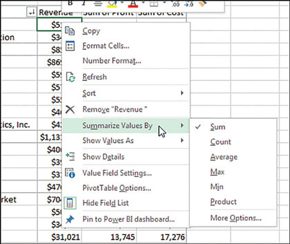
FIGURE 3-25 The right-click menu for any number in the Values area offers a flyout menu with the popular calculation options.
)
The following examples show how to use the various calculation options. To contrast the settings, you can build a pivot table where you drag the Revenue field to the Values area nine separate times. Each one shows up as a new column in the pivot table. Over the next several examples, you will see the settings required for the calculations in each column.
To change the calculation for a field, select one Value cell for the field and click the Field Settings button on the PivotTable Analyze tab of the ribbon. The Value Field Settings dialog box is similar to the Field Settings dialog box, but it has two tabs. The first tab, Summarize Values By, contains Sum, Count, Average, Max, Min, Product, Count Numbers, StdDev, StdDevP, Var, and VarP. You can choose 1 of these 11 calculation options to change the data in the column. In Figure 3-26, columns B through D show various settings from the Summarize Values By tab.
)
FIGURE 3-26 Choose from the 11 summary calculations on this tab.
The following examples show how to use the various calculation options. To contrast the settings, you can build a pivot table where you drag the Revenue field to the Values area nine separate times. Each one shows up as a new column in the pivot table. Over the next several examples, you will see the settings required for the calculations in each column.
To change the calculation for a field, select one Value cell for the field and click the Field Settings button on the PivotTable Analyze tab of the ribbon. The Value Field Settings dialog box is similar to the Field Settings dialog box, but it has two tabs. The first tab, Summarize Values By, contains Sum, Count, Average, Max, Min, Product, Count Numbers, StdDev, StdDevP, Var, and VarP. You can choose 1 of these 11 calculation options to change the data in the column. In Figure 3-26, columns B through D show various settings from the Summarize Values By tab.
Column B is the default Sum calculation. It shows the total of all records for a given market. Column C shows the average order for each item by market. Column D shows a count of the records. You can change the heading to say # Of Orders or # Of Records or whatever is appropriate. Note that the count is the actual count of records, not the count of distinct items.
 Note
Note
Counting distinct items has been difficult in pivot tables but is now easier using PowerPivot. See “Unlocking hidden features with the data model” in Chapter 10 for more details.
Far more interesting options appear on the Show Values As tab of the Value Field Settings dialog box, as shown in Figure 3-27. Fifteen options appear in the drop-down. Depending on the option you choose, you might need to specify either a base field or a base field and a base item. Columns E through J in Figures 3-26 and 3-27 show some of the calculations possible using Show Values As.
)
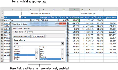
FIGURE 3-27 Fifteen different ways to show that data is available on this tab.
Table 3-1 summarizes the Show Values As options.
TABLE 3-1 Calculations in Show Values As
Show Values As |
Additional Required Information |
Description |
|---|---|---|
No Calculation |
None |
|
% of Grand Total |
None |
Shows percentages so all the detail cells in the pivot table total 100%. |
% of Column Total |
None |
Shows percentages that total up and down the pivot table to 100%. |
% of Row Total |
None |
Shows percentages that total across the pivot table to 100%. |
% of Parent Row Total |
None |
With multiple row fields, shows a percentage of the parent item’s total row. |
% of Parent Column Total |
None |
With multiple column fields, shows a percentage of the parent column’s total. |
Index |
None |
Calculates the relative importance of items. For an example, see Figure 3-31. |
% of Parent Total |
Base Field only |
With multiple row and/or column fields, calculates a cell’s percentage of the parent item’s total. |
Running Total In |
Base Field only |
Calculates a running total. |
% Running Total In |
Base Field only |
Calculates a running total as a percentage of the total. |
Rank Smallest to Largest |
Base Field only |
Provides a numeric rank, with 1 as the smallest item. |
Rank Largest to Smallest |
Base Field only |
Provides a numeric rank, with 1 as the largest item. |
% of |
Base Field and Base Item |
Expresses the values for one item as a percentage of another item. |
Difference From |
Base Field and Base Item |
Shows the difference of one item compared to another item or to the previous item. |
% Difference From |
Base Field and Base Item |
Shows the percentage difference of one item compared to another item or to the previous item. |
The capability to create custom calculations is another example of the unique flexibility of pivot table reports. With the Show Values As setting, you can change the calculation for a particular data field to be based on other cells in the Values area.
The following sections illustrate a number of Show Values As options.
Showing percentage of total
In Figure 3-26, column E shows % Of Total. Jade Miller, with $2.1 million in revenue, represents 31.67% of the $6.7 million total revenue. Column E uses % Of Column Total on the Show Values As tab. Two other similar options are % Of Row Total and % Of Grand Total. Choose one of these based on whether your text fields are going down the report, across the report, or both down and across.
Using % Of to compare one line to another line
The % Of option enables you to compare one item to another item. For example, in the current data set, Anne was the top sales rep in the previous year. Column F shows everyone’s sales as a percentage of Anne’s. Cell F7 in Figure 3-28 shows that Jeff’s sales were almost 58% of Anne’s sales.
)
FIGURE 3-28 This report is created using the % Of option with Anne Troy as the Base Item.
To set up this calculation, choose Show Values As, % Of. For Base Field, choose Rep because this is the only field in the Rows area. For Base Item, choose Anne Troy. The result is shown in Figure 3-26.
Showing rank
Two ranking options are available. Column G in Figure 3-29 shows Rank Largest To Smallest. Jade Miller is ranked #1, and Sabine Hanschitz is #12. A similar option is Rank Smallest To Largest, which would be good for the pro golf tour.
)
FIGURE 3-29 The Rank options will rank ascending or descending.
To set up a rank, choose Value Field Settings, Show Values As, Rank Largest To Smallest. You are required to choose Base Field. In this example, because Rep is the only row field, it is the selection under Base Field.
These rank options show that pivot tables have a strange way of dealing with ties. I say strange because they do not match any of the methods already established by the Excel functions =RANK(), =RANK.AVG(), and =RANK.EQ(). For example, if the top two markets have a tie, they are both assigned a rank of 1, and the third market is assigned a rank of 2.
Tracking running total and percentage of running total
Running total calculations are common in reports where you have months running down the column or when you want to show that the top N customers make up N% of the revenue.
In Figure 3-30, cell I8 shows that the top four sales reps account for 76.97% of the total sales.
)
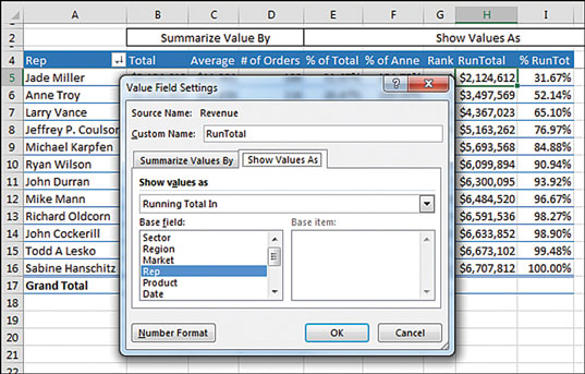
FIGURE 3-30 Show running totals or a running percentage of total.
Note
To produce this figure, you have to use the Sort feature, which is discussed in depth in Chapter 4, “Grouping, sorting, and filtering pivot data.” To create a similar analysis with the sample file, go to the drop-down menu in A4 and choose More Sort Options, Descending, By Total. Also note that the % Change From calculation shown in the next example is not compatible with sorting.
To specify Running Total In (as shown in Column H) or % Running Total In (Column I), select Field Settings, Show Values As, Running Total In. You have to specify a Base Field, which in this case is the Row Field: Rep.
Displaying a change from a previous field
Figure 3-31 shows the % Difference From setting. This calculation requires a Base Field and Base Item. You could show how each market compares to Anne Troy by specifying Anne Troy as the Base Item. This would be similar to Figure 3-26, except each market would be shown as a percentage of Anne Troy.
)
FIGURE 3-31 The % Difference From options enable you to compare each row to the previous or next row.
With date fields, it would make sense to use % Difference From and choose (previous) as the base item. Note that the first cell will not have a calculation because there is no previous date in the pivot table.
Tracking the percentage of a parent item
The legacy % Of Total settings always divides the current item by the grand total. In Figure 3-32, cell E4 says that Chicago is 2.75% of the total data set. A common question at the MrExcel.com message board is how to calculate Chicago’s revenue as a percentage of the Midwest region total. This was possible but difficult in older versions of Excel. Starting in Excel 2010, though, Excel added the % Of Parent Row, % Of Parent Column, and % Of Parent Total options.
)
FIGURE 3-32 An option in Excel enables you to calculate a percentage of the parent row.
To set up this calculation in Excel, use Field Settings, Show Values As, % Of Parent Row Total. Cell D4 in Figure 3-32 shows that Chicago’s $184,425 is 10.59% of the Midwest total of $1,741,424.
Although it makes sense, the calculation on the subtotal rows might seem confusing. D4:D8 shows the percentage of each market as compared to the Midwest total. The values in D9, D11, D16, and D19 compare the region total to the grand total. For example, the 31.67% in D11 says that the Northeast region’s $2.1 million is a little less than a third of the $6.7 million grand total.
Tracking relative importance with the Index option
The final option of the 11 calculations is Index. It creates a somewhat obscure calculation. Microsoft claims that this calculation describes the relative importance of a cell within a column. In Figure 3-33, Georgia peaches have an index of 2.55, and California peaches have an index of 0.50. This shows that if the peach crop is wiped out next year, it will be more devastating to Georgia fruit production than to California fruit production.
)
FIGURE 3-33 Using the Index function, Excel shows that peach sales are more important in Georgia than in California.
Here is the exact calculation:
First, divide Georgia peaches by the Georgia total. This is 180/210, or 0.857.
Next, divide total peach production (285) by total fruit production (847). This shows that peaches have an importance ratio of 0.336.
Now, divide the first ratio by the second ratio: 0.857/0.336.
In Ohio, apples have an index of 4.91, so an apple blight would be bad for the Ohio fruit industry.
I have to admit that, even after writing about this calculation for 10 years, there are parts that I don’t quite comprehend. What if a state like Hawaii relied on productions of lychees, but lychees were nearly immaterial to U.S. fruit production? If lychees were half of Hawaii’s fruit production but 0.001 of U.S. fruit production, the Index calculation would skyrocket to 500.