Model the data
- By Daniil Maslyuk
- 4/21/2021
- Skill 2.1: Design a data model
- Skill 2.2: Develop a data model
In this sample chapter from Exam Ref DA-100 Analyzing Data with Microsoft Power BI, you will review skills to design, develop, and optimize data models, and how you can use DAX to enhance data models.
In the previous chapter, we reviewed the skills necessary to get and transform data by using Power Query Editor—the process also known as data shaping. In this chapter, we explore the skills needed to model data.
Power BI allows you to analyze your data to some degree right after you load it, but a strong understanding of data modeling helps you perform sophisticated analysis using rich data modeling capabilities, which includes creating relationships, hierarchies, and various calculations to bring out the true power of Power BI. In Chapter 1, “Prepare the data,” in Power Query Editor we used the M language; once we loaded the data into the model, we used data analysis expressions, more commonly referred to as DAX, Power BI’s native query language.
In this chapter, we discuss the skills necessary to design, develop, and optimize data models. Additionally, we look at DAX and how you can use it to enhance data models.
Skills covered in this chapter:
2.1: Design a data model
2.2: Develop a data model
2.3: Create measures by using DAX
2.4: Optimize model performance
Skill 2.1: Design a data model
A proper data model is the foundation of meaningful analysis. A Power BI data model is a collection of one or more tables and, optionally, relationships. A well-designed data model enables business users to understand and explore their data and derive insights from it. Before you create any visuals, you should complete this step by loading your data and defining the relationships between tables. Data modeling often occurs at the beginning phase of building a Power BI report to be able to create efficient measures that build upon your data model. In this section, we design a data model by focusing our attention on tables and their relationships.
Define the tables
Once a query is loaded, it becomes a table in a Power BI data model. Tables can then be organized into different data model types, also known as schemas. Here are the three most common schemas in Power BI:
Flat (fully denormalized) schema
Star schema
Snowflake schema
There are other types of data models, though these three are the most common ones.
Flat schema
In the flat type of data model, all attributes are fully denormalized into a single table. Because there’s only one table, there are no relationships, and in most cases there’s no need for keys.
In our Wide World Importers example, you have a single table that contains all columns from all tables, meaning that the Sale and Targets columns will be in the same table. Because the tables have different data granularity, you run into problems when comparing actuals and targets.
From the performance point of view, flat schemas are very efficient, though there are downsides:
A single table can be cumbersome and confusing to navigate.
Columns and data can often be duplicated, leading to a comparatively large file size.
Mixing facts of different grains results in more complex DAX formulas.
Flat schemas are often used when connecting to a single, simple source. However, for more complex data models, flat schemas should be avoided in Power BI as much as possible.
Star schema
When you use a star schema, tables are conceptually classified into two kinds:
Fact tables These tables contain the metrics you want to aggregate. Fact tables have foreign keys, which are required to create relationships with dimensions, and columns that you can aggregate. In the Wide World Importers example, the Sale and Targets tables are fact tables. Fact tables are sometimes also known as data tables.
Dimension tables These tables contain the descriptive attributes that help you slice and dice your fact tables. A dimension table has a unique identifier—a key column—and descriptive columns. In the Wide World Importers example, City, Customer, Date, Employee, and Stock Item are dimension tables. Dimension tables are also sometimes known as lookup tables.
In a star schema, fact tables are surrounded by dimensions, as shown in Figure 2-1.
)
Figure 2-1 Star schema with Sale as the only fact table
The star schema has its name because it resembles a star, where the fact table is in the center and dimension tables are the star points. It’s possible to have more than one fact table in a star schema, and it will still be a star schema.
In most cases, the star schema is the preferred data modeling approach in Power BI. It addresses the shortcomings of the flat schema:
Fields are logically grouped, making the model easier to understand.
There is less duplication of data, which results in more efficient storage.
You don’t need to write overly complex DAX formulas to work with fact tables that have a different grain.
Snowflake schema
The snowflake schema is similar to the star schema, except it can have some dimensions that “snowflake” from other dimensions. You can see an example in Figure 2-2.
)
Figure 2-2 Snowflake schema with State Province snowflaking from the City table
In the Wide World Importers example, if you loaded the State Province query, the data model could be a snowflake schema. This is because the State Province table is related to the City dimension table, which in turn is related to the Sale fact table.
Snowflake schemas can be beneficial when there are fact tables that have different grains.
Configure table and column properties
Both tables and columns have various properties you can configure, and you can do so in the Model view. To see the properties of a column or a table, select an object, and you see its properties in the Properties pane.
Table properties
For tables, depending on the storage mode, you can configure the following properties:
Name Enter the table name.
Description This property allows you to add a description of the table that will be stored in the model’s metadata. It can be useful when you’re building reports because you can see the description when you hover over the table in the Fields pane.
Synonyms These are useful for the Q&A feature of Power BI, which we review in the next skill section. You can add synonyms so that the Q&A feature can understand that you’re referring to a specific table even if you provide a different name for it.
Row label This property is useful for both Q&A and featured tables, and it allows you to select a column whose values will serve as labels for each row. For example, if you ask Q&A to show “sales amount by product,” and you select the Product Name column as the Row label of the Product table, then Q&A will show the sales amount for each product name.
Key column If your table has a column that has unique values for every row, you can set the column as the key column.
Is hidden You can hide a table so that it disappears from the Fields pane.
Is featured table This property allows you to make a table featured, which will allow it to be used in Excel in certain scenarios.
Storage mode This property can be set to Import, DirectQuery, or Dual, as we covered in the previous chapter.
Column properties
For columns, depending on data type, you can configure the following properties:
Name Enter the column name.
Description This property is the same as for tables; you can add a column description.
Synonyms This property is the same as for tables; you can add synonyms to make the column work better with Q&A.
Display folder You can group columns from the same table into display folders.
Is hidden Hiding a column keeps it in the data model and hides it in the Fields pane.
Data type The available data types are different from those available in Power Query. For instance, Percentage, Date/Time/Timezone, and Duration are not available.
Format Different data types will show different formatting properties. For example, for numeric columns you’ll see the following additional properties: Percentage format, Thousands separator, and Decimal places.
Sort by column You can sort one column by another. For example, you can sort month names by month numbers to make them appear in the correct order.
Data category This property can be useful for some visuals, and the default is Uncategorized. Depending on the data type, you can also select one of the following:
Address
City
Continent
Country/Region
County
Latitude
Longitude
Place
Postal Code
Summarize by This property determines how the column will be aggregated if you put it into a visual. The options you can choose depend on the data type. For most data types, in addition to Don’t Summarize/None, you can choose Count and Count (Distinct)/Distinct Count, while for numeric columns, you can also choose Sum, Average, Minimum/Min, and Maximum/Max. Power BI will try to automatically determine the appropriate summarization, but it’s not always accurate.
Is nullable You can disallow null values for a column; if, during data refresh, a column is determined to get a null value, the refresh will fail.
 Exam Tip
You should know the difference between formatting a column and using the FORMAT function in DAX; FORMAT can be used to create a new column and always output text, whereas formatting a column retains the original data type.
Define quick measures
A measure in Power BI is a dynamic evaluation of a DAX query that will change in response to interactions with other visuals, enabling quick, meaningful exploration of your data. Creating efficient measures will be one of the most useful tools you can use to build insightful reports. If you are new to DAX and writing measures, or you are wanting to perform quick analysis, you have the option of creating a quick measure. There are several ways to create a quick measure:
Select Quick measure from the Home ribbon.
Right-click or select the ellipsis next to a table or column in the Fields pane and select New quick measure. This method may prefill the quick measure form shown next.
If you already use a field in a visual, select the drop-down arrow next to the field in the Values section and select New quick measure. This method also may prefill the quick measure form shown next. If possible, this will add the new quick measure to the existing visualization. You’ll be able to use this measure in other visuals too.
The following calculations are available as quick measures:
Aggregate per category
Average per category
Variance per category
Max per category
Min per category
Weighted average per category
Filters
Filtered value
Difference from filtered value
Percentage difference from filtered value
Sales from new customers
Time intelligence
Year-to-date total
Quarter-to-date total
Month-to-date total
Year-over-year change
Quarter-over-quarter change
Month-over-month change
Rolling average
Totals
Running total
Total for category (filters applied)
Total for category (filters not applied)
Mathematical operations
Addition
Subtraction
Multiplication
Division
Percentage difference
Correlation coefficient
Text
Star rating
Concatenated list of values
Each calculation has its own description and a list of field wells. You can see an example in Figure 2-3.
)
Figure 2-3 Quick measures dialog box
For example, by using quick measures, you can calculate average profit per employee for Wide World Importers:
Select Quick measure on the Home ribbon.
From the Calculation drop-down list, select Average per category.
Drag the Profit column from the Sale table to the Base value field well.
Drag the Employee column from the Employee table to the Category field well.
Select OK.
After you complete these steps, you can find the new measure called Profit average per Employee in the Fields pane.
If you select the new measure, you’ll see its DAX formula:
You can modify the formula, if needed. Reading the DAX can be a great way to learn how measures can be written.
Flatten out a parent-child hierarchy
Parent-child hierarchies are often used for employees, charts of accounts, and organizations. Instead of being composed of several columns, parent-child hierarchies are defined by two columns: node key and parent node key. In the Wide World Importers example, you can see a parent-child hierarchy in the Employee table, shown in Figure 2-4.
)
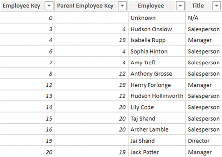
Figure 2-4 Employee table
For our purposes, you can ignore the “Unknown” employee. By observing the Parent Employee Key values, note the following:
Jai Shand is a director and has no “parent employee.”
Isabella Rupp, Henry Forlonge, and Jack Potter are all managers, and they all report to Jai Shand, their “parent employee.”
Isabella Rupp, Henry Forlonge, and Jack Potter all act as “parent employees” to various salespersons.
There are three levels in the hierarchy: director level, manager level, and salesperson level.
If you were to create additional columns with each column containing a hierarchy level, you would need to merge the Employee table with itself in Power Query, which would widen the table and create a more complex query. In Power BI, you can also solve this problem by using DAX and calculated columns.
To create a calculated column in a table, right-click the table in the Fields pane and select New column. In the Wide World Importers example, you can use the following formula to create a calculated column in the Employee table:
This adds a new column that has all hierarchy levels listed, and you can see it in Figure 2-5.
)
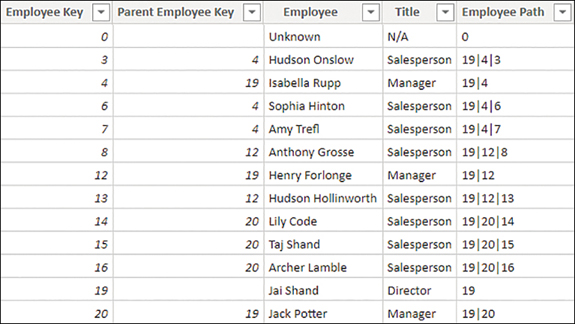
Figure 2-5 Employee Path column
The Employee Path column is only useful for technical purposes, so it can be hidden.
The next step is to add the following three calculated columns to the Employee table:
All three columns use the PATHITEM function to retrieve the employee key of the specified level and LOOKUPVALUE to look up the employee name based on their key.
After you add the columns, the table should look like the one in Figure 2-6.
)
Figure 2-6 The Director, Manager, and Salesperson columns in the Employee table
Note that some Manager and Salesperson column values are blank; Jai Shand, for example, is a director with nobody above him, so both Manager and Salesperson are blank. In the Wide World Importers example, this is not a big problem because only keys of salespersons are used in the Sale table. If this is undesirable, you can use the last parameter of LOOKUPVALUE, which provides the default value, as follows:
Using the last parameter of LOOKUPVALUE in this case ensures that all columns have values.
Define role-playing dimensions
In some cases, there may be more than one way to filter a fact table by a dimension. In the Wide World Importers example, the Sale table has two date columns: Invoice Date Key and Delivery Date Key, both of which can be related to the Date column from the Date table. Therefore, it is possible to analyze sales by invoice date or delivery date, depending on the business requirements. In this situation, the Date dimension is a role-playing dimension.
Although Power BI allows you to have multiple physical relationships between two tables, no more than one can be active at a time, and other relationships must be set as inactive. Active relationships, by default, propagate filters. The choice of which relationship should be set as active depends on the default way of looking at data by the business.
To create a relationship between two tables, you can drag a key from one table on top of the corresponding key from the other table in the Model view.
In the Wide World Importers example, you can drag the Date column from the Date table on top of the Invoice Date Key column in the Sale table. Doing so creates an active relationship, signified by the solid line. Next, you can drag the Date column from the Date table on top of the Delivery Date Key column from the Sale table. This creates an inactive relationship, signified by the dashed line. The result should look like Figure 2-7.
)
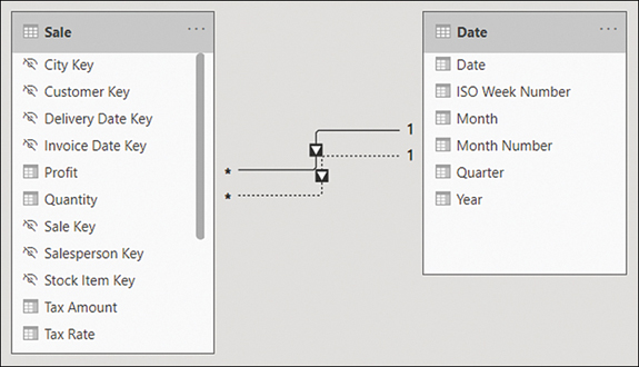
Figure 2-7 Relationships between Sale and Date
If you hover over a relationship line in the Model view, it highlights the fields that participate in the relationship.
In the Wide World Importers model, you should also create the relationships listed in Table 2-1.
Table 2-1 Additional relationships in Wide World Importers
From: Table (Column) |
To: Table (Column) |
|---|---|
Sale (City Key) |
City (City Key) |
Sale (Customer Key) |
Customer (Customer Key) |
Sale (Salesperson Key) |
Employee (Employee Key) |
Sale (Stock Item Key) |
Stock Item (Stock Item Key) |
Inactive relationships can be activated by using the USERELATIONSHIP function in DAX, which also deactivates the default active relationship, if any. The following is an example of a measure that uses USERELATIONSHIP:
To use USERELATIONSHIP, you must define a relationship in the model first so that the function only works for existing relationships. This approach is useful for scenarios such as the Wide World Importers example, where you have multiple date columns within the same fact table.
If you have several measures that you want to analyze by using different relationships, this may result in your data model having many similar measures, cluttering your data model to a degree.
Another drawback of using USERELATIONSHIP is that you cannot analyze data by using two relationships at the same time. For instance, if you have a single Date table, it won’t be possible to see which sales were invoiced last year and shipped this year.
An alternative to USERELATIONSHIP that addresses these drawbacks is to use separate dimensions for each role or relationship. In case of Wide World Importers, you would have Delivery Date and Invoice Date dimensions, which would make it possible to analyze sales by both delivery and invoice dates.
You have a few ways to create the new dimensions based on the existing Date table, one of which is to use calculated tables. For the Invoice Date table, the DAX formula would be as follows:
The benefit of using calculated tables instead of referencing or duplicating queries in Power Query is that if you have calculated columns in your Date table, they will be copied in a calculated table, whereas you would have to re-create the same columns if you used Power Query to create the copies of the dimension.
When you’re creating separate dimensions, it’s best to rename the columns to make it clear where fields are coming from. For example, instead of leaving the column called Date, rename it to Invoice Date. You can do so by right-clicking a field in the Fields pane and selecting Rename or by double-clicking a field. Alternatively, you can rename fields by using a more complex calculated table expression. For example, you could use the SELECTCOLUMNS function in DAX to rename columns.
Define a relationship’s cardinality and cross-filter direction
In the previous section, you saw how to create relationships between tables. In this section, we review the concepts of cardinality and cross-filter direction of relationships.
You can edit a relationship by double-clicking it in the Model view. For example, in Figure 2-8 you can see the options for one of the relationships between the Sale and the Date tables.
)
Figure 2-8 Relationship options
In the relationship options, you can select tables from drop-down lists. For each table, you get a preview of it, from which you can select a column that will be part of a relationship. Unlike for the Merge operation in Power Query, only one column from each table can be part of a relationship.
The Make this relationship active check box determines whether the relationship is active. Between two tables, there can be no more than one active relationship.
When using DirectQuery, the Assume referential integrity option is available, and it can improve query performance in certain cases.
Two options are worth reviewing in more detail: Cardinality and Cross-filter direction.
Cardinality
Depending on the selected tables and columns, you can select one of the following options:
Many-to-one
One-to-one
One-to-many
Many-to-many
Many-to-one and one-to-many are the same kind of relationship, and they only differ in the order in which the tables are listed. “Many” means that a key may appear more than once in the selected column, whereas “one” means a key value appears only once in the selected column. In our Wide World Importers example earlier, the Sale table was on the many side, whereas the Date table was on the one side; a single date appeared only once in the Date table, though there could be multiple sales on the same date in the Sale table.
One-to-one is a special kind of relationship in which a key value appears only once on both sides of the relationship. This type of relationship can be useful for splitting a single dimension with many columns into separate tables. You should use one-to-one only if you are confident that no duplicates will appear in this table, since duplicates would cause immediate errors in your data model.
Many-to-many relationships in this context refer to direct relationship between two tables, neither of which is guaranteed to have unique keys. We review this type of relationship later in this chapter.
Cross-filter direction
This option determines the direction in which filters flow. For many-to-one and one-to-many relationships, you can select Single or Both.
If you select Single, then the filters from the table on the “one” side will filter through to the table on the “many” side. This setting is signified by a single arrowhead on the relationship line in the Model view.
If you select Both, then filters from both tables will flow in both directions, and such relationships are also known as bidirectional. This setting is signified by two arrowheads on the relationship line in the Model view, facing in opposite directions. When this option is selected, you can also select Apply security filter in both directions to make row-level security filters flow in both directions, too.
To illustrate the concept, consider the data model shown in Figure 2-9.
)
Figure 2-9 Sample data model
From this data model, you can create two table visuals as follows:
Table 1: Distinct count of Stock Item by Year
Table 2: Distinct count of Year by Stock Item
Both table visuals are shown in Figure 2-10. The first four rows are shown for Table 2 for illustrative purposes.
You can see that in Table 1, the numbers are different for different years and the total, whereas in Table 2, the Distinct Count of Year is showing 6 for all rows, including the total.
)
Figure 2-10 Table visuals
The numbers are different in Table 1 because filters from the Date table can reach the Stock Item table through the Sale table; the Date table filters the Sale table because there is a one-to-many relationship; then the Sale table filters the Stock Item table because there is a bidirectional relationship. In 2017, 2018, and 2019, Wide World Importers coincidentally sold 219 stock items, whereas in 2020, they sold 227 stock items. At the total level you see 228, which is not the total sum of stock items sold across all years.
In Table 2, the numbers are the same because filters from the Stock Item table don’t reach the Date table since there is no bidirectional filter. Even though you only had sales in four years, you see 6 across all rows, which is the number of years in the Date table.
It’s also possible to set the cross-filter direction by using the CROSSFILTER function in DAX, as you can see in the following example:
The syntax of CROSSFILTER is similar to USERELATIONSHIP—the first two parameters are related columns. Additionally, there’s the third parameter—direction—and it can be one of the following:
BOTH This option corresponds to Both in the relationship cross-filter direction options.
NONE This option deactivates the relationship, and it corresponds to the cleared Make this relationship active check box.
ONEWAY This option corresponds to Single in the relationship cross-filter direction options.
Bidirectional filters are sometimes used in many-to-many relationships with bridge tables when direct many-to-many relationships are not desirable.
Design the data model to meet performance requirements
The way you design a Power BI data model ultimately affects the performance of reports. A well-designed data model takes into consideration both business requirements and the constraints of data sources. Performance tuning is a broad topic; we cover some key concepts you should keep in mind while designing your data model:
Storage mode
Relationships
Aggregations
Cardinality
Storage mode
As you saw in the first chapter, Power BI supports several connectivity modes:
Imported data
DirectQuery
Live Connection
Refer to the first chapter for more details.
Relationships
When you’re using composite models, it’s important to remember that relationships perform differently depending on the storage mode of the related tables.
You can use the concept of islands as an analogy of where data is queried to understand how data models work in practice. If you use two DirectQuery data sources, then each of them is a separate island. In contrast, all imported data resides in the same island regardless of where it originally came from, because all imported data is queried from memory. When you connect to data on the same island, you will have the fastest results since you don’t need to “swim” to another island.
You can see different kinds of relationships ordered from fastest to slowest in the following list:
One-to-many intra-island relationships
Direct many-to-many relationships
Many-to-many relationships with bridge tables
Cross-island relationships
We review many-to-many relationships in detail in the next section.
Aggregations
When using DirectQuery, you can import some summarized data so that the most frequently queried data resides in memory and is retrieved quickly, whereas detailed data is queried from the data source. This feature is called aggregations, and we review it later in this chapter.
Cardinality
The term cardinality, in addition to defining relationships, also refers to the number of distinct values in a column. Power BI stores imported data in columns, not rows. For this reason, the cardinality of each column affects performance. In general, the fewer distinct values there are, the better performance. We review ways to reduce cardinality later in this chapter.
Resolve many-to-many relationships
Many-to-many relationships occur very frequently in models. In general, many-to-many relationships happen in two cases:
Many-to-many relationships between dimensions For example, one client may have multiple accounts, and an account may belong to different clients.
Relationships between tables at different granularities For example, you may have a sales table at the date level and a targets table at the month level. Both tables could be related to a single date table. In this case, the relationship between the targets and date tables would be many-to-many since they are of different grain.
In the Wide World Importers example, a many-to-many relationship exists between the Date and Stock Item tables; on each date, multiple stock items could be sold, and each stock item could be sold on multiple dates. In this case, the relationship goes through the Sale table. Additionally, a many-to-many relationship exists between the Date dimension and the Targets fact table because the grain of the tables is different.
Power BI supports many-to-many relationships of two kinds:
Direct many-to-many relationships
Many-to-many relationships through a bridge table
Direct many-to-many relationships
As you saw earlier in this chapter, Power BI supports the many-to-many cardinality for relationships, allowing you to create a many-to-many relationship between two tables directly.
You will now create a relationship between the Targets table and the Customer table based on Buying Group, the same way you create other relationship types:
Go to the Model view.
Drag the Buying Group column from the Customer table on top of the Buying Group column from the Targets table.
Ensure the Make this relationship active check box is selected.
Set Cross filter direction to Single (Customer filters Targets). Figure 2-11 shows how your options should look.
Select OK.
You can see asterisks on both sides of the relationship that indicate the many-to-many relationship.
This method performs well when the number of unique values on each side of a relationship is fewer than 1,000; otherwise, the method may be slow and creating a bridge table would be a more efficient solution. The technical details on why this happens are out of the scope of the exam.
Another limitation that this kind of relationships has is that you cannot use the RELATED function in DAX since neither table is on the “one” side.
)
Figure 2-11 Relationship options
This creates a relationship, as shown in Figure 2-12.
)
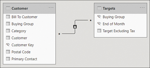
Figure 2-12 Relationship between Customer and Targets
Many-to-many relationships with bridge tables
A different way of creating a many-to-many relationship in Power BI is to use a bridge table. A bridge table is a table that allows you to create one-to-many relationships with each table that is in a many-to-many relationship. Bridge tables can be of two kinds:
A one-column table with unique values The bridge table is on the one side in each relationship. This is typical for relating facts or tables that have different grains.
A two-column table with unique combination of values The bridge table is on the many side in each relationship. This is common for many-to-many relationships between dimensions.
In the Wide World Importers example, the Date and Targets tables have different grains:
Targets has one row per Buying Group and the end-of -month date.
Date has one row per date.
Note that the Date table does not have a column that contains end-of-month dates. Dates are a special case, because you can create a one-to-many relationship between Date and Targets and avoid having a many-to-many relationship.
To illustrate this in practice, let’s create a many-to-many relationship between Date and Targets based on End of Month date. First, add the End of Month column to the Date table:
Launch Power Query Editor by selecting Transform Data on the Home ribbon.
Select the Date column in the Date query.
On the Add column ribbon, select From date & time > Date > Month > End of month.
There are several ways to create a bridge table through Power Query, calculated tables in DAX, or importing a new table that all achieve the same outcome. For our requirement, let’s create a bridge table between the Date and Targets table by using Power Query:
In Power Query Editor, right-click the Date query and select Reference.
Rename the newly created Date (2) query to End of Month.
Right-click the End of Month column header and select Remove other columns.
Right-click the End of Month column and select Remove duplicates.
On the Home ribbon, select Close & apply.
You can now relate the Date and Targets tables as shown in Table 2-2.
Table 2-2 Date, End of Month, and Targets relationships
From: Table (Column) |
To: Table (Column) |
Active |
Cross Filter Direction |
|---|---|---|---|
Date (End of Month) |
End of Month (End of Month) |
Yes |
Both |
Targets (End of Month) |
End of Month (End of Month) |
Yes |
Single |
You can see the relationships in Figure 2-13.
)
Figure 2-13 Date, End of Month, and Targets relationships
Create a common date table
By default, Power BI creates a calendar hierarchy for each date or date/time column from your data sources.
Although these can be useful in some cases, it’s best practice to create your own date table, which has several benefits:
You can use a calendar other than Gregorian.
You can have weeks in the calendar.
You can filter multiple fact tables by using a single date dimension table.
If you don’t have a date table you can import from a data source, you can create one yourself. It’s possible to create a date table by using Power Query or DAX, and there’s no difference in performance between the two methods.
Creating a calendar table in Power Query
In Power Query, you can use the M language List.Dates function, which returns a list of dates, and then convert the list to a table and add columns to it. The following query provides a sample calendar table that begins on January 1, 2016:
If you want to add the calendar table to your model, start with a blank query:
In Power Query Editor, select New Source on the Home ribbon.
Select Blank Query.
With the new query selected, select Query > Advanced Editor on the Home ribbon.
Replace all existing code with the code above and select Done.
Give your query an appropriate name such as Calendar or Date.
The result should look like Figure 2-14, where the first few rows of the query are shown.
)
Figure 2-14 Sample calendar table built by using Power Query
You may prefer having a table in Power Query when you intend to use it in some other queries, since it’s not possible to reference calculated tables in Power Query.
Creating a calendar table in DAX
If you choose to create a date table in DAX, you can use the CALENDAR or CALENDARAUTO function, both of which return a table with a single Date column. You can then add calculated columns to the table, or you can create a calculated table that has all the columns right away.
The CALENDAR function requires you to provide the start and end dates, which you can hardcode for your business requirements or calculate dynamically:
The CALENDARAUTO function scans your data model for dates and returns an appropriate date range automatically.
To build a table similar to the Power Query table we built before, we can use the following calculated table formula in DAX:
Define the appropriate level of data granularity
Data granularity refers to the grain of data, or the level of detail that a table can provide. For example, the Targets table in the Wide World Importers example provides a target figure for each month for each buying group, so the granularity is the month-buying group. If you filter the Targets table by a field that is at lower granularity—such as Customer or Date—you won’t get any meaningful results. Figure 2-15 shows targets by date.
)
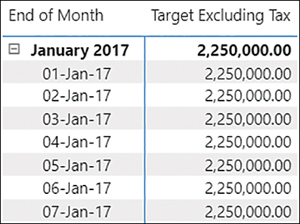
Figure 2-15 Targets by date
You can see that the same number is repeated at month level and date level, which can be confusing. To deal with this, you need to account for cases when targets are shown at unsupported levels of granularity.
There are a few ways of solving the problem. For example, you can make a measure return a result only when the unsupported grains are not filtered:
You can see the result in Figure 2-16.
)
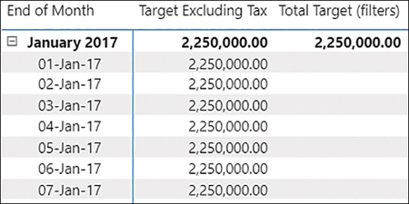
Figure 2-16 Total Target measure used in a table
Although this approach can work in many cases, it has a downside. If new columns are introduced and they aren’t at the supported level of granularity, then you’d need to modify your code. An alternative is to check the number of rows in the supported dimensions as follows:
You may still want to check whether unsupported tables are filtered, so you’re still using ISFILTERED for some tables. The result, shown in Figure 2-17, is the same as for the previous measure.
)
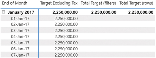
Figure 2-17 An alternative measure