Grouping, sorting, and filtering pivot data

- By Michael Alexander and Bill Jelen
- 4/7/2019
- Using the PivotTable Fields list
- Sorting in a pivot table
- Filtering a pivot table: an overview
- Using filters for row and column fields
- Filtering using the Filters area
- Grouping and creating hierarchies in a pivot table
- Creating hierarchies
- Next steps
Grouping and creating hierarchies in a pivot table
Pivot tables have the ability to do roll-ups in memory. You can roll daily dates up to weeks, months, quarters, or years. Time can roll up to minutes or hours. Numbers can be grouped into equal-size buckets. Text entries can be grouped into territories.
You can use the Power Pivot grid to define a hierarchy so you can quickly drill down on a pivot table or chart.
Grouping numeric fields
The Grouping dialog box for numeric fields enables you to group items into equal ranges. This can be useful for creating frequency distributions. The pivot table in Figure 4-42 is quite the opposite of anything you’ve seen so far in this book. The numeric field—Revenue—is in the Rows area. A text field—Customer—is in the Values area. When you put a text field in the Values area, you get a count of how many records match the criteria. In its present state, this pivot table is not that fascinating; it is telling you that exactly one record in the database has a total revenue of $23,990.
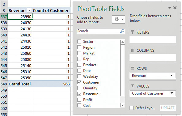
FIGURE 4-42 Nothing interesting here—just lots of order totals that appear exactly one time in the database.
Select one number in column A of the pivot table. Select Group Field from the Analyze tab of the ribbon. Because this field is not a date field, the Grouping dialog box offers fields for Starting At, Ending At, and By. As shown in Figure 4-43, you can choose to show amounts from 0 to 30,000 in groups of 5,000.
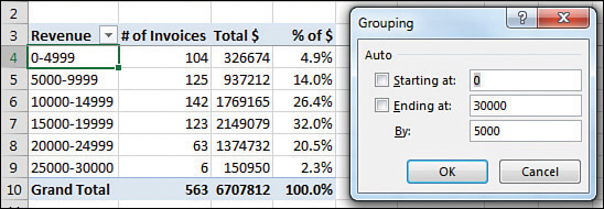
FIGURE 4-43 Create a frequency distribution by grouping the order size into $5,000 buckets.
After grouping the order size into buckets, you might want to add additional fields, such as Revenue and % Of Revenue shown as a percentage of the total.
 NOTE
NOTE
The grouping dialog box requires all groups to be the same size. I have heard questions where people want to group into 0–100K, 200K–500K, but this is not possible using the Grouping feature. You would have to add a new column to the source data in order to create these groupings.
CASE STUDY: GROUPING TEXT FIELDS FOR REDISTRICTING
Say that you get a call from the VP of Sales. The Sales Department is secretly considering a massive reorganization of the sales regions. The VP would like to see a report showing revenue after redistricting. You have been around long enough to know that the proposed regions will change several times before the reorganization happens, so you are not willing to change the Region field in your source data quite yet.
First, build a report showing revenue by market. The VP of Sales is proposing eliminating two regional managers and redistricting the country into three super-regions. While holding down the Ctrl key, highlight the five regions that will make up the new West region. Figure 4-44 shows the pivot table before the first group is created.
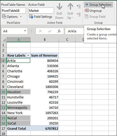
FIGURE 4-44 Use the Ctrl key to select the noncontiguous cells that make up the new region.
From the Analyze tab, click Group Selection. Excel adds a new field called Market2. The five selected regions are arbitrarily rolled up to a new territory called Group1. In Figure 4.45, the Group1 label in A4 is the first item in the new Market2 virtual field. The other items in the Market2 field includee Atlanta in A10, Charlotte in A12 and so on. The similar items in A11 and A13 are items in the original Market field. Use care while holding down the Ctrl key to select the unbolded markets for the South region: Atlanta in row 11, Charlotte in row 13, Huntsville in row 11, and Louisville in row 23...
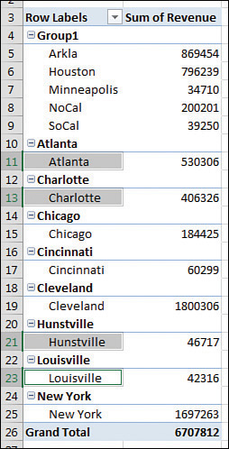
FIGURE 4-45 The first super-region is arbitrarily called Group1.
Click Group Selection to group the markets in the proposed Southeast region. Repeat to group the remaining regions into the proposed Northeast region. Figure 4-46 shows what it looks like when you have grouped the markets into new regions. Five things need further adjustment: the names of Group1, Group2, Group3, and Market2, and the lack of subtotals for the outer row field.
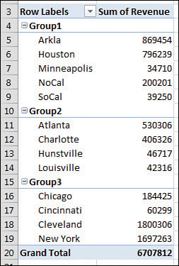
FIGURE 4-46 The markets are grouped, but you have to do some cleanup.
Cleaning up the report takes only a few moments:
Select cell A4. Type West to replace the arbitrary name Group1.
Select cell A10. Type Southeast to replace the arbitrary name Group2.
Select A15. Type Northeast to replace Group3.
Select any outer heading in A4, A10, or A15. Click Field Settings on the Analyze tab.
In the Field Settings dialog box, replace the Custom Name of Market2 with Proposed Region. Also, in the Field Settings dialog box, change the Subtotals setting from None to Automatic.
Figure 4-47 shows the pivot table that results, which is ready for the VP of Sales.
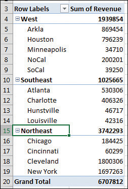
FIGURE 4-47 It is now easy to see that these regions are heavily unbalanced.
You can probably predict that the Sales Department needs to shuffle markets to balance the regions. To go back to the original regions, select any Proposed Region cell in A4, A10, or A15 and choose Ungroup. You can then start over, grouping regions in new combinations.
Grouping date fields manually
Excel provides a straightforward way to group date fields. Select any date cell in your pivot table. On the Analyze tab, click Group Field in the Group option.
When your field contains date information, the date version of the Grouping dialog box appears. By default, the Months option is selected. You have choices to group by Seconds, Minutes, Hours, Days, Months, Quarters, and Years. It is possible—and usually advisable—to select more than one field in the Grouping dialog box. In this case, select Months and Years, as shown in Figure 4-48.
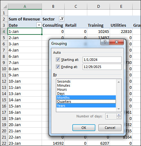
FIGURE 4-48 Business users of Excel usually group by months (or quarters) and years.
There are several interesting points to note about the resulting pivot table. First, notice that the Years field has been added to the PivotTable Fields list. Don’t let this fool you. Your source data is not changed to include the new field. Instead, this field is now part of your pivot cache in memory.
Another interesting point is that, by default, the Years field is automatically added to the same area as the original date field in the pivot table layout, as shown in Figure 4-49. Although this happens automatically, you are free to pivot months and years onto the opposite axis of the report. This is a quick way to create a year-over-year sales report.
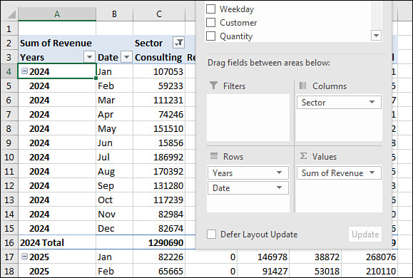
FIGURE 4-49 By default, Excel adds the new grouped date field to your pivot table layout.
Including years when grouping by months
Although this point is not immediately obvious, it is important to understand that if you group a date field by month, you also need to include the year in the grouping. If your data set includes January 2024 and January 2025, selecting only months in the Grouping dialog box will result in both January 2024 and January 2025 being combined into a single row called January (see Figure 4-50).
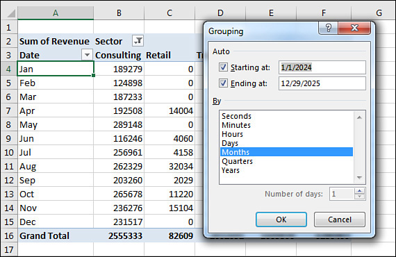
FIGURE 4-50 If you fail to include the Year field in the grouping, the report mixes sales from last January and this January into a single row called January.
Grouping date fields by week
The Grouping dialog box offers choices to group by second, minute, hour, day, month, quarter, and year. It is also possible to group on a weekly or biweekly basis.
The first step is to find either a paper calendar or an electronic calendar, such as the Calendar feature in Outlook, for the year in question. If your data starts on January 1, 2024, it is helpful to know that January 1 is a Monday that year. You need to decide if weeks should start on Sunday or Monday or any other day. For example, you can check the paper or electronic calendar to learn that the nearest starting Sunday is December 31, 2023.
Select any date heading in your pivot table. Then select Group Field from the Analyze tab. In the Grouping dialog box, clear all the By options and select only the Days field. This enables the spin button for Number of Days. To produce a report by week, increase the number of days from 1 to 7.
Next, you need to set up the Starting At date. If you were to accept the default of starting at January 1, 2024, all your weekly periods would run from Monday through Sunday. By checking a calendar before you begin, you know that you want the first group to start on December 31, 2023, to have weeks that run Sunday through Monday. Figure 4-51 shows the settings in the Grouping dialog box and the resulting report.
)
FIGURE 4-51 Group dates up to weekly periods.
 CAUTION
If you choose to group by week, none of the other grouping options can be selected. You cannot group this or any field by month, quarter, or year. You cannot add calculated items to the pivot table.
AutoGrouping pivot table dates
Excel 2016 introduced an AutoGroup feature for dates. If you dragged a date field to a pivot table, Excel would quickly add date rollups and define a hierarchy for the dates.
The feature was turned on by default, and the only way to turn it off was a change in the Registry.
I love the concept of teaching people that daily dates can easily be rolled up. But for the people who needed to report daily dates, the AutoGroup was inconsistent and confusing. The logic used to choose which rollups would be present would sometimes leave out daily dates from the hierarchy.
Today, Excel 2019 will not automatically AutoGroup. You can choose to allow the AutoGroup if you loved this feature. Go To File, Options, Data, and deselect Disable Automatic Grouping Of Date/Time Columns In Pivot Tables.
Understanding how Excel decides what to AutoGroup
If you have daily dates that include an entire year or that fall in two or more years, Excel 2019 groups the daily dates to include years, quarters, and months. If you need to report by daily dates, you will have to select any date cell, choose Group Field, and add Days. Note that the rules change if your data is in the Data Model. In that case, AutoGroup would include daily dates as well.
If you have daily dates that fall within one calendar year and span more than one month, Excel groups the daily dates to month and includes daily dates.
CAUTION
If your company is closed on New Year’s Day and you have no sales on January 1, a data set that stretches from January 2 to December 31 will fit the “less than a full year” case and will include months and daily dates.
If your data contains times that do not cross over midnight, you get hours, minutes, and seconds. If the times span more than one day, you get days, hours, minutes, and seconds.
Using AutoGroup
Say that you have a column in your data set with daily dates that span two years. When you add this Date field to the Rows area of your pivot table, you will see rows for each year instead of hundreds of daily dates. If your pivot table is in Tabular layout, you will see extra columns for Quarter and Date that appear to have no data (see Figure 4-52).
)
FIGURE 4-52 Excel can automatically groups two years’ worth of daily dates up to months, quarters, and years
When you look in the Pivot Table Fields list, you see that the Rows area automatically includes three fields: Years, Quarter, and Date. All three of these are virtual fields created by grouping the daily dates up to months, quarters, and years.
The three fields are added to either the Rows area or the Columns area. However, only the highest level of the date field will be showing. To see the quarters and years, click one cell that contains a year and then click the Expand button in the Analyze tab of the ribbon (see Figure 4-53). To see months, select a cell containing a quarter and click the Expand button again (see Figure 4-54).
)
FIGURE 4-53 Use Expand Field to show the quarters.
)
FIGURE 4-54 Expand Field again to show the monthly data.
Creating an easy year-over-year report
You can use date grouping to easily create a year-over-year report. You can either manually group the dates to years or use the AutoGroup.
Follow these steps:
Create a pivot table with Years in the Columns area and Months in the Rows area. Drag Revenue to the Values area. By default, the pivot table will offer a Grand Total column, as shown in Figure 4-55.
Right-click the Grand Total heading and choose Remove Grand Total.
Drag Revenue a second time to the Values area.
In the Columns area, drag Years so it is below Values. You will have the pivot table shown in Figure 4-56.
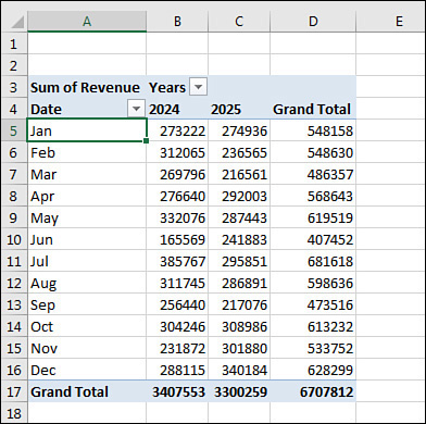
FIGURE 4-55 Group daily dates to months and years. Drag Years to go across the report.
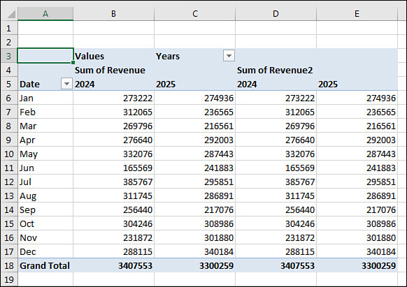
FIGURE 4-56 This year and last year appear twice across the top of the report.
Double-click the Sum of Revenue2 heading in cell D4 to display the Value Field Settings dialog box.
In the Value Field Settings dialog box, select the Show Values As tab. In the Show Values As drop-down menu, choose % Difference From. In the Base Field list, choose Years. In the Base Item, choose (Previous), as shown in Figure 4-57.
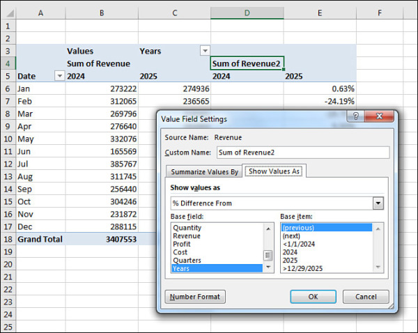
FIGURE 4-57 Change the second Revenue columns to percentage difference from the previous year.
Close the Value Field Settings dialog box. Column E will show the percentage change from the first year to the last year. Column D will be blank because the pivot table has no data from 2023 to use to compare to 2024.
Hide column D.
Select the 2025 heading in E5. Press Ctrl+1 for Format Cells. On the Number tab, choose Custom. Type a format of ;;;"% Change".
)
)
)
)
)
)
)
)
)
)
)
)
You have a report showing year 1 versus year 2 and a percentage change. You can easily remove the Months from column A and insert Region, Market, or Product to see the year-over-year change. Figure 4-58 shows a year-over-year report for Regions.
)
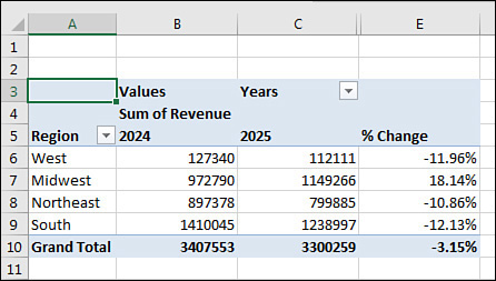
FIGURE 4-58 Once you have the year-over-year report set up, you can swap any field in to column A.