Create charts and objects
- By Joan Lambert
- 7/6/2017
Objective 5.2: Format charts
A chart includes many elements, some required and some optional. The chart content can be identified by a chart title. Each data series is represented in the chart by a unique color. A legend that defines the colors is created by default but is optional. Each data point is represented in the chart by a data marker, and can also be represented by a data label that specifies the data point value. The data is plotted against an x-axis (or category axis) and a y-axis (or value axis). Three-dimensional charts also have a z-axis (or series axis). The axes can have titles, and gridlines can more precisely indicate the axis measurements.
To augment the usefulness or the attractiveness of a chart, you can add elements. You can adjust each element in appropriate ways, in addition to adjusting the plot area (the area defined by the axes) and the chart area (the entire chart object). You can move and format most chart elements, and easily add or remove them from the chart.
)
You can add and remove chart elements from the Chart Elements pane or from the Design tool tab.
)
By default, Excel creates charts on the same worksheet as the source data. You can move or size a chart on the worksheet by dragging the chart or its handles, or by specifying a precise position or dimensions. If you prefer to display a chart on its own sheet, you can move it to another worksheet in the workbook, or to a dedicated chart sheet.
Move a chart to its own sheet to remove the distraction of the background data
You can apply predefined combinations of layouts and styles to quickly format a chart. You can also apply a shape style to the chart area to set it off from the rest of the sheet.
)
If the chart you initially create doesn’t depict your data the way you want, you can change the chart type or select a different variation of the chart. Many chart types have two-dimensional and three-dimensional variations or optional elements.
)
To display and hide chart elements
Click the chart, and then click the Chart Elements button (labeled with a plus sign) that appears in the upper-right corner of the chart. In the Chart Elements pane, select the check boxes of the elements you want to display, and clear the check boxes of the elements you want to hide.
On the Design tool tab, in the Chart Layouts group, click Add Chart Element, click the element type, and then click the specific element you want to display or hide.
On the Design tool tab, in the Chart Layouts group, click Quick Layout, and then click the combination of elements you want to display.
To resize a chart
Select the chart, and then drag the sizing handles.
On the Format tool tab, in the Size group, enter the Height and Width dimensions.
On the Format tool tab, click the Size dialog box launcher, and enter the Height and Width dimensions or Scale Height and Scale Width percentages on the Size & Properties page of the Format Chart Area pane.
To move a selected chart
Drag the chart to another location on the worksheet.
Or
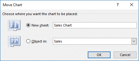
On the Design tool tab, in the Location group, click Move Chart.
In the Move Chart dialog box, select a location and click OK.
To change the type of a selected chart
On the Design tool tab, in the Type group, click Change Chart Type.
In the Change Chart Type dialog box, click a new type and sub-type, and then click OK.
To apply a style to a selected chart
On the Design tool tab, in the Chart Styles gallery, click the style you want.
Click the Chart Styles button (labeled with a paintbrush) that appears in the upper-right corner of the chart. On the Style page of the Chart Styles pane, click the style you want.
To apply a shape style to a selected chart
On the Format tool tab, in the Shape Styles gallery, click the style you want.
To change the color scheme of a selected chart
On the Design tool tab, in the Chart Styles group, click Change Colors, and then click the color scheme you want.
Click the Chart Styles button that appears in the upper-right corner of the chart. On the Color page of the Chart Styles pane, click the color scheme you want.
Apply a different theme to the workbook.