Create charts and objects
- By Joan Lambert
- 7/6/2017
In this sample chapter from MOS 2016 Study Guide for Microsoft Excel, learn about exam objectives related to presenting data in charts and enhancing worksheets through images, business diagrams, and text boxes.
Objective 5.1: Create charts
Charts (also referred to as graphs) are created by plotting data points onto a two-dimensional or three-dimensional axis to assist in data analysis and are therefore a common component of certain types of workbooks. Presenting data in the form of a chart can make it easy to identify trends and relationships that might not be obvious from the data itself.
Different types of charts are best suited for different types of data. The following table shows the available chart types and the data they are particularly useful for plotting.
Chart type |
Typically used to show |
Variations |
Area |
Multiple data series as cumulative layers showing change over time |
Two-dimensional or three-dimensional Independent or stacked data series |
Bar |
Variations in value over time or the comparative values of several items at a single point in time |
Two-dimensional or three-dimensional Stacked or clustered bars Absolute or proportional values |
Box & Whisker |
Distribution of data within a range, including mean values, quartiles, and outliers |
|
Column |
Variations in value over time or comparisons |
Two-dimensional or three-dimensional Stacked or clustered columns Absolute or proportional values |
Funnel |
Categorized numeric data such as sales or expenses |
|
Histogram |
Frequency of occurrence of values within a data set |
Optional Pareto chart includes additive contributions |
Line |
Multiple data trends over evenly spaced intervals |
Two-dimensional or three-dimensional Independent or stacked lines Absolute or proportional values Can include markers |
Pie |
Percentages assigned to different components of a single item (nonnegative, nonzero, no morethan seven values) |
Two-dimensional or three-dimensional Pie or doughnut shape Secondary pie or bar subset |
Radar |
Percentages assigned to different components of an item, radiating from a center point |
Can include markers and fills |
Stock |
High, low, and closing prices of stock market activity |
Can include opening price and volume traded |
Sunburst |
Comparisons of multilevel hierarchical data |
|
Surface |
Trends in values across two different dimensions in a continuous curve, such as a topographic map |
Two-dimensional or three-dimensional Contour or surface area |
Treemap |
Comparisons of multilevel hierarchical data |
|
X Y (Scatter) |
Relationships between sets of values |
Data points as markers or bubbles Optional trendlines |
Waterfall |
The effect of positive and negative contributions on financial data |
Optional connector lines |
You can also create combination charts that overlay different data charts in one space.
To plot data as a chart, all you have to do is select the data and specify the chart type. You can select any type of chart from the Charts group on the Insert tab. You can also find recommendations based on the selected content either on the Charts tab of the Quick Analysis tool or on the Recommended Charts tab of the Insert Chart dialog box.
)
Excel displays the active data in each of the recommended chart thumbnails
Before you select the data that you want to present as a chart, ensure that the data is correctly set up for the type of chart you want to create (for example, you must set up hierarchical categories differently for a box & whisker, sunburst, or treemap chart than for a bar or column chart). Select only the data you want to appear in the chart. If the data is not in a contiguous range of rows or columns, either rearrange the data or hold down the Ctrl key while you select noncontiguous ranges.
A chart is linked to its worksheet data, so any changes you make to the plotted data are immediately reflected in the chart. If you want to add or delete values in a data series or add or remove an entire series, you need to increase or decrease the range of the plotted data in the worksheet.
)
Sometimes a chart does not produce the results you expect because the data series are plotted against the wrong axes; that is, Excel is plotting the data by row when it should be plotting by column, or vice versa. You can quickly switch the rows and columns to see whether that produces the desired effect. You can preview the effect of switching axes in the Change Chart Type dialog box.
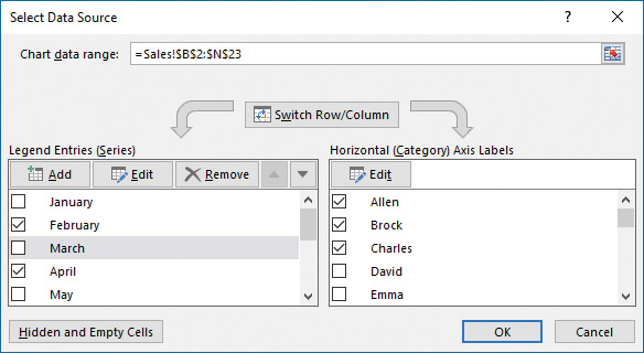
You can present a different view of the data in a chart by switching the data series and categories across the axis.
)
You can swap data across the axis from the Change Chart Type dialog box or you can more precisely control the chart content from the Select Data Source dialog box.
Choosing the data to include in a chart
To plot data as a chart on the worksheet
On the worksheet, select the data that you want to plot in the chart.
Do any of the following:
On the Insert tab, in the Charts group, click the general chart type you want, and then on the menu, click the specific chart you want to create.
On the Insert tab, in the Charts group, click Recommended Charts. Preview the recommended charts by clicking the thumbnails in the left pane. Then click the chart type you want, and click OK.
Click the Quick Analysis button that appears in the lower-right corner of the selection, click Charts, and then click the chart type you want to create.
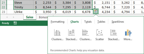
The Quick Analysis menu provides quick access to data transformation options
)
To modify the data points in a chart
In the linked Excel worksheet, change the values within the chart data.
To select the chart data on the linked worksheet
Click the chart area or plot area.
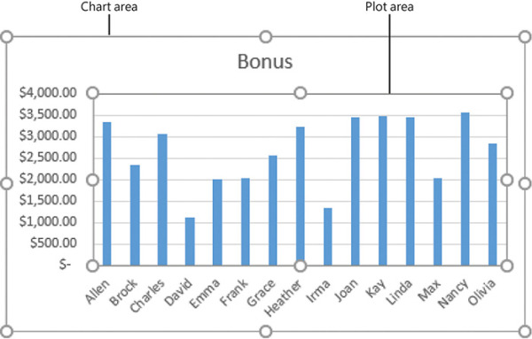
Selecting data on the chart selects the corresponding data on the worksheet
)
To change the range of plotted data in a selected chart
In the linked Excel worksheet, drag the corner handles of the series selectors until they enclose the series you want to plot.
Or
Do either of the following:
On the Design tool tab, in the Data group, click Select Data.
Right-click the chart area or plot area, and then click Select Data.
In the Select Data Source dialog box, do any of the following, and then click OK:
Click the worksheet icon at the right end of the Chart data range box, and then drag to select the full range of data you want to have available.
In the Legend Entries (Series) list and Horizontal (Category) Axis Labels boxes, select the check boxes of the rows and columns of data you want to plot.
To plot additional data series in a selected chart
Do either of the following:
On the Design tool tab, in the Data group, click Select Data.
Right-click the chart area or plot area, and then click Select Data.
In the Select Data Source dialog box, at the top of the Legend Entries (Series) list, click Add.
In the Edit Series dialog box, do either of the following:
Enter the additional series in the Series name box.
Click in the Series name box and then drag in the worksheet to select the additional series.
If necessary, enter or select the series values. Then click OK.
In the Select Data Source dialog box, click OK.
To switch the display of a data series in a selected chart between the series axis and the category axis
On the Design tool tab, in the Data group, click the Switch Row/Column button.
Or
Do either of the following:
On the Design tool tab, in the Data group, click Select Data.
Right-click the chart area or plot area, and then click Select Data.
In the Select Data Source dialog box, click Switch Row/Column, and then click OK.