Visuals in Power BI

- By Errin O'Connor
- 4/5/2019
Power BI visuals out of the box
As of this writing, Power BI Desktop offers OOTB visuals, with updated and new visuals released by Microsoft on a regular basis. These OOTB visuals include the following:
Bar charts
Column charts
Line charts
Area charts
Line and stacked column charts
Ribbon charts
Waterfall charts
Scatter charts
Bubble charts
Pie charts
Donut charts
Funnel charts
Gauge charts
Cards
Multi-row card
KPI visuals
Tables
Matrix visuals
Maps
ArcGIS maps
You’ll find these visuals in the Visualizations pane in Power BI. The following sections briefly explore each of these types of visuals.
 IMPORTANT
You’ll learn how to add visuals to a report in later chapters.
Bar, column, and ribbon charts
When you have categorical data, then a bar or column chart is an excellent way to display it. Bar charts depict data horizontally, while column charts depict it vertically. Bar and column charts are widely used in organizations. Indeed, you’ll generally find that bar and column charts cover 70% of most simple dashboards.
Suppose you are working with a large database of information from a single hospital. The database contains lots of heterogeneous data with details about the hospital’s patients, including their age. If, for example, you wanted to build a visual showing the age breakdown of the hospital’s patients, a bar or column chart might be a good pick.
Power BI offers the following types of bar and column charts out of the box (see Figure 3-1):
Stacked bar charts This type of chart is useful if you need to know both the values of various subcategories of data as well as the total value. For example, the stacked bar chart in chart 1 in Figure 3-1 shows length of patient stay by program, differentiated by age category, all in a single bar.
Clustered bar charts This type of chart shows a comparison of all categories and subcategories as a part of a whole. For example, the clustered bar chart in chart 2 in Figure 3-1 shows the same data as the chart in screen 1, but with the age group information presented as separate bars (rather than combined into a single bar).
100% stacked bar charts Like a regular stacked bar chart, a 100% stacked bar chart combines various subcategories of data into a single bar. However, it is presented as a percentage. (See chart 3 in Figure 3-1 for an example.)
Stacked, clustered, and 100% stacked column charts These are just like their bar chart counterparts, but turned on their side, so the bars are vertical rather than horizontal. (See charts 4–6 in Figure 3-1.)
Ribbon charts These are similar to stacked column charts but present each category according to rank or value. (See chart 7 in Figure 3-1.)

Figure 3-1 Bar, column, and ribbon charts in Power BI.
)
Line, area, and combination charts
Line, area, and combination charts are useful for representing data that changes over time, while ribbon charts are simply a variation on column charts. For more on these types of charts, see Figure 3-2, and read on.
Line charts As mentioned, these are useful for time-based data—for example, if you need to analyze sales data for a manufacturing firm, including their unit budget, quota, and quantities, over specific period. (See chart 1 in Figure 3-2.)
Area charts An area chart is a type of line chart. Unlike line charts, however, which simply depict continuous change over a period of time, area charts also reflect volume. (See chart 2 in Figure 3-2.)
Stacked area charts These are similar to area charts but show the data in a stacked format, enabling you to visualize how each category contributes to the total. (See chart 3 in Figure 3-2.)
Line and stacked column charts This type of chart is a combination of a line chart and a stacked column chart. You might use a line and stacked column chart if, for example, you had school data, and you wanted to show how many days students in each grade were present and absent over a specific period. (See chart 4 in Figure 3-2.)
Line and clustered column charts This type of chart is a combination of a line chart and a clustered column chart. You might use a line and clustered column chart in the same scenario as you would a line and stacked column chart, but you want to more clearly see how many days students were marked present versus absent. (See chart 5 in Figure 3-2).
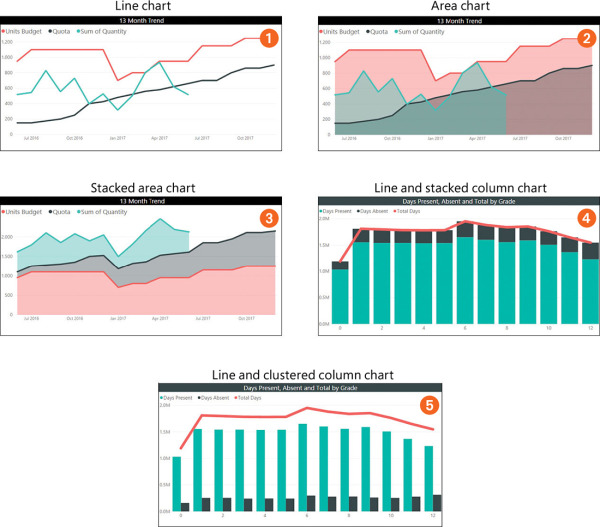
Figure 3-2 Line, area, and combination charts in Power BI.
)
Waterfall, treemap, scatter, bubble, pie, donut, funnel, and gauge charts
Power BI offers several more specialized charts for use in reports and dashboards:
Waterfall charts This type of chart shows changes in a value over time. It’s useful when you need to maintain a running total. (See chart 1 in Figure 3-3.)
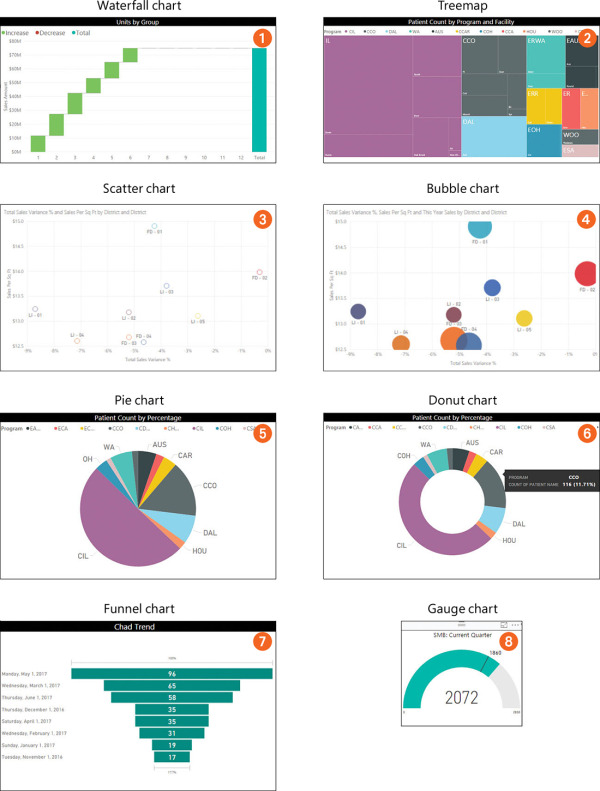
Figure 3-3 More specialized charts available in Power BI.
Treemaps A treemap represents data as rectangles in hierarchical form. Treemaps generally show proportions in distinct colors and sizes to enable users to more easily understand large volumes of data. This type of chart is great when data involves multiple subcategories that are difficult to analyze in bar charts. For example, chart 2 in Figure 3-3 shows hospital data that reveals patient count by program and facility. Programs are depicted as color-coded rectangles, with the size of each rectangle reflecting the number of patients in that program.
Scatter charts This type of chart features a horizontal and a vertical axis to represent numerical values, enabling you to show at least two sets of numbers as a series of XY coordinates. An example of a scenario in which a scatter chart would be useful is if you want to show yearly sales data by variance of total sales and by sales value per square foot. (See chart 3 in Figure 3-3.)
Bubble charts This type of chart depicts data in the form of bubbles, with the size of the bubble reflecting the data value. Bubble charts are often used in the same types of scenarios as scatter charts. (See chart 4 in Figure 3-3.)
Pie charts A pie chart is a circular statistical representation of data that is divided into slices to illustrate proportion or percentage. For example, chart 5 in Figure 3-3 shows the spread of patient count by program.
Donut charts These are similar to pie charts, but with circular section cut out in the middle. (See chart 6 in Figure 3-3.)
Funnel charts This type of chart shows linear data with sequential connected stages, with each funnel stage representing a percentage of the whole. It is often used to analyze sales-conversion data across an organization. For example, chart 7 in Figure 3-3 shows a sales-trend analysis for a period of nine months.
Gauge charts A gauge chart depicts data in an arc to show progress toward a goal. The left side of the arc shows the minimum value, while the right side shows the maximum value. (See chart 8 in Figure 3-3.)
)
Cards, multi-row cards, and KPI visuals
In addition to the charts and graphs already discussed, Power BI offers additional types of visuals, including the following:
Cards These are used to represent a single value of data analyzed according to specific parameters assigned. For example, the card shown in chart 1 in Figure 3-4 features the average length of stay by patients in a hospital.
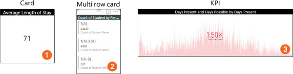
Figure 3-4 Cards, multi-row cards, and KPI visuals.
Multi-row cards These show multiple rows of data in a single card sheet to help users to arrive at a specific conclusion. For example, the multi-row card in chart 2 in Figure 3-4 shows the number of students by class period.
KPI visuals A key performance indicator (KPI) visual tracks the status of progress toward a defined target. It shows whether you are behind (red), on track (yellow), or ahead of the game (green). (You can change this color scheme if you wish.) For example, chart 3 in Figure 3-4 shows attendance information for a school. Because the KPI of 1.52K has not been met, the data appears red.
)
Table and matrix visuals
Tables and matrixes are additional examples of visuals in Power BI. (See Figure 3-5.)
Tables This type of visual is best suited for numbers in tabular format representing certain grades of data grouped together. Tables, which allow for conditional formatting, facilitate easy and efficient group analysis. For example, the table in Figure 3-5 (screen 1) shows attendance data grouped by date.
Matrices Matrix visuals allow for tabular representation of data with drill-down capabilities, enabling you to include additional rows or columns or a particular section. For example, the matrix in Figure 3-5 (screen 2) presents location data such that when users click a division, they are directed to another visual with locations. Drilling down further reveals yet more data.
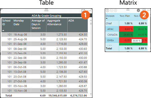
Figure 3-5 Table and matrix visuals.
Bubble, filled, and ArcGIS maps
Power BI supports the use of the following map visuals:
Bubble maps This visual overlays data in the form of a bubble on a geographical map generated by Bing using location information you provide. The size of the bubble over a specific geographic region reflects the data value. For example, the left map (see screen 1 in Figure 3-6) contains bubbles that represent the number of political parties in Canada and in the United States, with the bubble in Canada appearing smaller than the bubble in the US. To drill down to see the breakdown of parties within the United States, as shown in the map on the right, click the US bubble in the left map. (You will learn more about drilling down for additional information later in this chapter.)
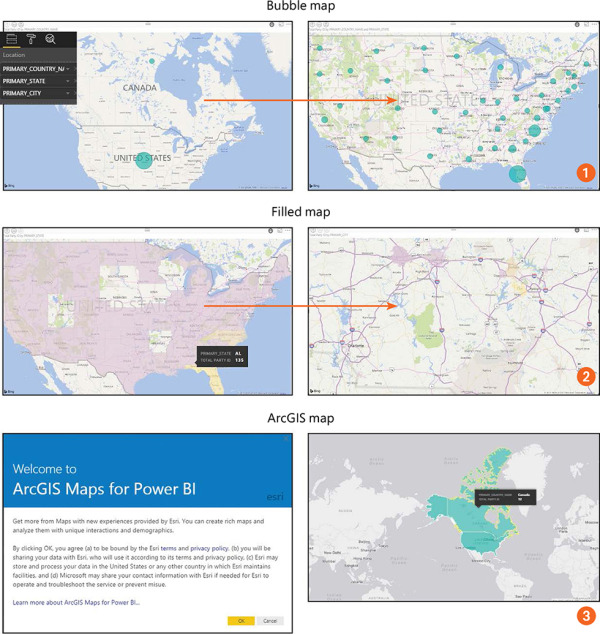
Figure 3-6 Bubble, filled, and ArcGIS maps.
Filled maps This shows data within geospatial areas on a map (again, generated by Bing using location information you provide) rather than as an individual point, with lighter shades indicating lower values and darker shades indicating higher values. (See screen 2 in Figure 3-6.) Filled maps provide an overview of data distribution across a location, such as a country, state, or city, and are a great way to show relationships among data and to check for spatial patterns.
ArcGIS maps Although these maps are provided by a third-party vendor, ESRI, they are offered in Power BI out of the box. They enable you to define specific locations and provide users with rich infographic content. Users can zoom in, zoom out, and select individual or multiple locations. When you add data to the map, it is automatically configured as needed. These maps are extremely beneficial for users who need to visualize data geographically. (See screen 3 in Figure 3-6.)
)
)